


Modern organizations rely on dashboards to make faster, smarter decisions. In this week's Team Academy Power BI session, learners focused on one of the most valuable business intelligence skills: Data Visualization and Dashboard Creation.
Using the Northwind Traders dataset, participants learned how to transform raw data into professional executive dashboards that are visually appealing, interactive, and aligned with business goals.
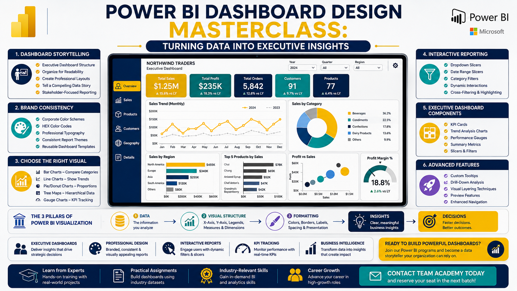
🖼️ Create Dashboards That Tell a Story
The session began by exploring the fundamentals of dashboard design and why visualization plays a critical role in business decision-making.
Participants learned how to:
✅ Structure executive dashboards effectively
✅ Organize visuals for maximum readability
✅ Create professional report layouts
✅ Build interactive reports for stakeholders
A key lesson emphasized throughout the session was:
Great dashboards don't just display data—they communicate insights.
🎨 Building Strong Brand Consistency
One of the most important topics covered was creating reusable Power BI templates aligned with company branding.
Learners practiced:
-
Applying corporate color schemes
-
Using HEX color codes
-
Selecting professional fonts
-
Creating consistent report themes
-
Saving templates for future projects
Instead of manually formatting every report, participants learned how to build standardized dashboard templates that can be reused across multiple business projects.
📈 Choosing the Right Visual for the Right Message
The session included a detailed overview of Power BI visualization types and their best use cases.
Participants explored:
Bar Charts
Ideal for category comparisons.
Line Charts
Perfect for trend analysis over time.
Pie & Donut Charts
Useful for showing proportional relationships.
Tree Maps
Effective for hierarchical data visualization.
Gauge Charts
Excellent for KPI tracking and executive reporting.
The focus was not only on creating visuals but also understanding when and why each visual should be used.
⚡ Interactive Dashboards with Slicers
Interactivity is one of Power BI's greatest strengths.
Participants learned how to create:
-
Dropdown slicers
-
Date range slicers
-
Category filters
-
Dynamic report interactions
The session demonstrated how dashboard users can filter information instantly and see all connected visuals update automatically.
This approach creates a more engaging and user-friendly reporting experience.
📊 Executive Dashboard Components
The training covered the essential elements every executive dashboard should include:
✔ Company Logo
✔ Dashboard Title
✔ KPI Cards
✔ Slicers and Filters
✔ Trend Analysis Charts
✔ Performance Gauges
✔ Summary Metrics
Participants also learned how proper alignment, spacing, borders, and formatting contribute to a polished and professional appearance.
💡 Advanced Visualization Features
Beyond basic visuals, learners explored advanced Power BI capabilities including:
-
Custom tooltips
-
Visual layering techniques
-
Interactive drill-down experiences
-
Preview features and new functionality
-
Enhanced report navigation
These features help users access deeper insights without overcrowding the dashboard.
🛠️ Hands-On Dashboard Development
Using practical business scenarios, participants worked on:
-
KPI tracking dashboards
-
Patient submission reporting
-
Attendance monitoring dashboards
-
Interactive filtering systems
-
Executive reporting layouts
The class reinforced the three core components behind every successful visualization:
1️⃣ Data
The information being analyzed.
2️⃣ Visual Structure
The X-axis, Y-axis, legends, and measures.
3️⃣ Formatting
Colors, borders, labels, spacing, and presentation.
Mastering all three creates dashboards that are both functional and visually compelling.
🚀 Why Dashboard Design Matters
Businesses today generate more data than ever before.
Organizations need professionals who can:
✅ Transform data into insights
✅ Build executive dashboards
✅ Create interactive reports
✅ Design branded visualizations
✅ Support strategic decision-making
Power BI visualization skills continue to be among the most sought-after capabilities in business intelligence and analytics roles worldwide.
📚 Practice Assignment
To strengthen their skills, participants were assigned to:
-
Create 6–7 additional visualizations
-
Apply professional formatting
-
Use borders and alignment effectively
-
Organize dashboards for executive audiences
-
Prepare their reports for review in the next session
This hands-on approach ensures learners gain practical experience alongside theoretical knowledge.
🎯 Ready to Build Professional Power BI Dashboards?
At Team Academy, learners gain practical experience through real-world projects and business scenarios.
Learn How To:
📊 Create Executive Dashboards
🎨 Design Professional Visualizations
⚡ Build Interactive Reports
📈 Track KPIs Effectively
🚀 Deliver Business Insights with Confidence
Join our Power BI programs and transform data into decisions.
📩 Contact Team Academy today to reserve your seat in the next batch.


